
Typographic cover frame
typographic-cover-frame
Define
A stable type frame (masthead, rules, folio) that stays put so the image inside can change every issue.
Mechanism
Fixed architecture. Recognition lives in the frame. News lives in the picture. The two jobs stay separate.
Verdict
We publish on a fixed schedule and need instant recognition plus a new image every time.
Don't
There is no series. A one-off frame is just a layout.
Copy skeleton
Fixed, top: [MASTHEAD: the name, same size and place every issue] [SERIES LABEL: weekly, monthly or season]
Fixed, corner: [FOLIO: issue number, date or season stamp]
Changes: [THIS ISSUE'S IMAGE: one picture, full frame, nothing printed over it]
Changes: [ONE LINE: this issue's title, or who it is for]
Fixed, foot: [STANDING PROMISE: the service fact that never moves] · [PRICE]
Optional: [BRANCH OR PARTNER NAME: a quiet slot that can be swapped]
Gulf note
Build the frame right to left from the start: masthead on the right, the Arabic line above the English, and the same order in every post, because a frame designed in English and mirrored later breaks the reading path. Ramadan is the natural run: 30 days, one fixed frame, and only the day number and the picture change. On Instagram and Snapchat the frame is what lets a follower recognise the series before reading a word. When a picture of people does not suit a post, the frame lets a product-only image carry the issue without losing recognition.
Rights-cleared examples

Cairo Film Distribution Company cinema programme ad, al-Kawakib 1969
The column works as a timetable the reader actually needs: each cinema name sits in a black tab with its current film beside it, split by Cairo and Alexandria, so a moviegoer finds tonight's choice in one scan.

Collier's cover poster, The House of Devils, 1913
The cover lines are ranked by size, not just listed, so the eye is told exactly which of the four is the lead and the other three become bonus value rather than clutter.

Collier's weekly cover poster, Eagle Shannon Ropes One, 1916
Almost the whole lower half of the picture is left as bare paper, and the flat navy shadow is what makes that emptiness read as glare rather than as an unfinished drawing.

Dodd Mead & Co. new and standard books catalogue, Christmas 1899-1900
The front is built like a shop sign: the title stacked in a black central panel, two footmen in red livery standing guard under banners reading 1899 and 1900, one with an armful of books, and a heap of volumes spilling across the chequered floor under "CHRISTMAS", so the catalogue reads as a season's worth of gifts.

Egyptian General Cinema Organisation weekly cinema programme ad, al-Kawakib 1970
Rank is built into the layout: Ramses, Opera, Diana and Miami each get a box with the film title in bold and the stars underneath, like Ahmed Mazhar and Zizi al-Badrawi for Love and the Price.
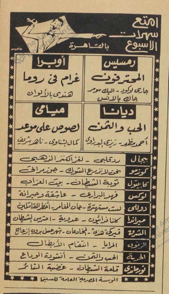
Egyptian General Cinema Organisation weekly cinema programme ad, al-Kawakib 1970
The programme is built as a grid the reader can scan in seconds: four large boxes for the premiere halls, then a ladder of cinema names in black tabs with two films each.

Giedion's Bauen in Frankreich book jacket
Repetition is the device: only the changing noun is enlarged and coloured, so the eye reads three materials as three chapters without a subtitle explaining it.

John Held, Jr. magazine cover: The girl who gave him the cold shoulder
The caption is a pun with a delay built in: the reader recognises an idiom about being snubbed, then looks up and finds a literal sunburnt shoulder, and the two meanings collide on the page rather than in the sentence.

Kitab al-Hilal monthly book ad, al-Musawwar 1962
The ad is built like the series itself: the same crescent, the words monthly cultural series and the same 10 piastre price box frame a new title and a new author each month, so a regular reader spots it at once and only has to read the title.

Malerei Fotografie Film dust jacket, 1925 first edition
The type is printed straight onto the photograph with no panel or box behind it, which is the case the book makes inside: the photograph is a ground for design, not an illustration dropped into a layout.

Proletarian Student no. 2 cover
Every letter is manufactured from the same rectangular unit, which is the argument of the cover restated as a drawing method: mass-produced parts, no handwriting, no individual flourish.
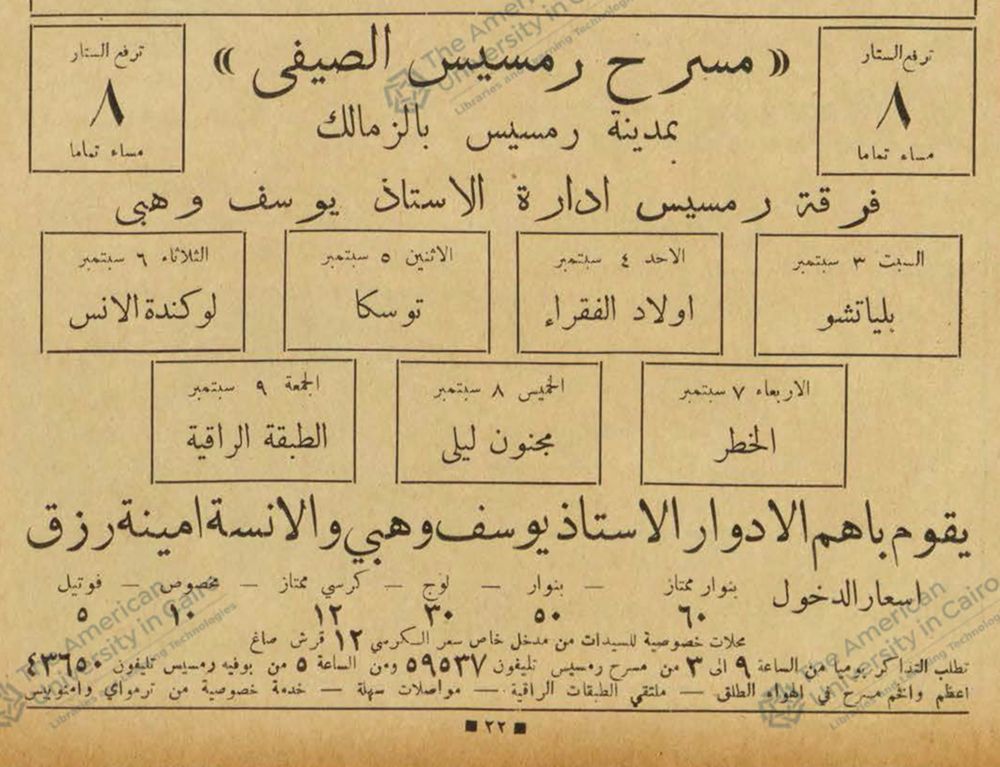
Ramses Summer Theatre programme ad, al-Kawakib 1932
The theatre keeps the same frame every week: the name in quotation marks, a box on each side promising the curtain rises at 8 exactly, the troupe line, the stars, and the price ladder.
If this library is useful, leave an email
We send new patterns, ads, and notes when we add them. Name and phone are optional.
You are on the list
We will write when we add more library material.