
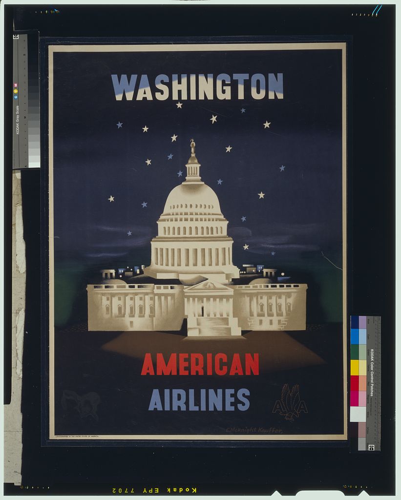
American Airlines 'Washington' poster (US Capitol)
The pattern
This still is filed under Image carries the claim.
Define
One image does the entire argument. Copy, if any, is a caption, not a second ad.
Mechanism
Pictorial claim. The picture is readable as a sentence. If we need a paragraph, we picked the wrong picture.
Verdict
The idea is visual and the surface is a poster, a feed, or a silent frame.
Why it works
The palette does the patriotic work without a flag: red word, white building, blue field, stars scattered as if the sky were the canton. Airbrushed soft-edge rendering of the Capitol against a hard flat ground makes the monument glow rather than merely appear, which converts a government building into a piece of theatre. Splitting AMERICAN and AIRLINES into two colours turns the brand name itself into the third element of the flag, so the airline is absorbed into the national symbol instead of sitting next to it. Night is chosen over day because a lit dome against dark is the only version of the Capitol that photographs as spectacle.
Steal this when
Reach for this when the destination or subject is a famous, over-photographed landmark and you need it to feel like an occasion. Shoot or render it at night, drop the background to one flat dark field, and let the brand name be built from the palette everyone already reads as belonging to the place.