
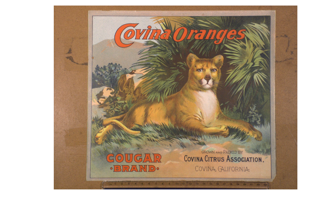
Cougar Brand Covina oranges crate label
The pattern
This still is filed under Pack as storefront.
Define
The pack is the store. On a shelf or a thumbnail, it must stop, name, and close without a clerk.
Mechanism
Shelf rhetoric. Hierarchy, claim, and proof live on the face. The first five centimeters do the campaign's job.
Verdict
The buy happens in a glance among competitors: grocery, pharmacy, app store icon.
Why it works
Crate labels are auction signage, not consumer packaging, and this one is built for identification at distance: one animal, front-on, centred, on a ground of contrasting green, so the crate reads as Cougar from across a warehouse floor before any lettering is legible. The colour choice is functional rather than decorative - the orange-red script is the only warm mass in an otherwise green and grey picture, which pulls the eye and pre-sells the fruit inside. Naming the town twice, once in the product line and once in the packer credit, builds a place reputation that every grower in the association benefits from, which is the co-operative marketing logic underneath the whole California citrus label tradition. The animal is arbitrary to the product on purpose: it is a mnemonic handle for repeat ordering, not a claim.
Steal this when
Use this when your product is physically identical to everyone else's and the buying moment is fast, visual and at distance. Pick one arbitrary, high-contrast mnemonic, make it the whole picture, and let origin do the quality argument.