
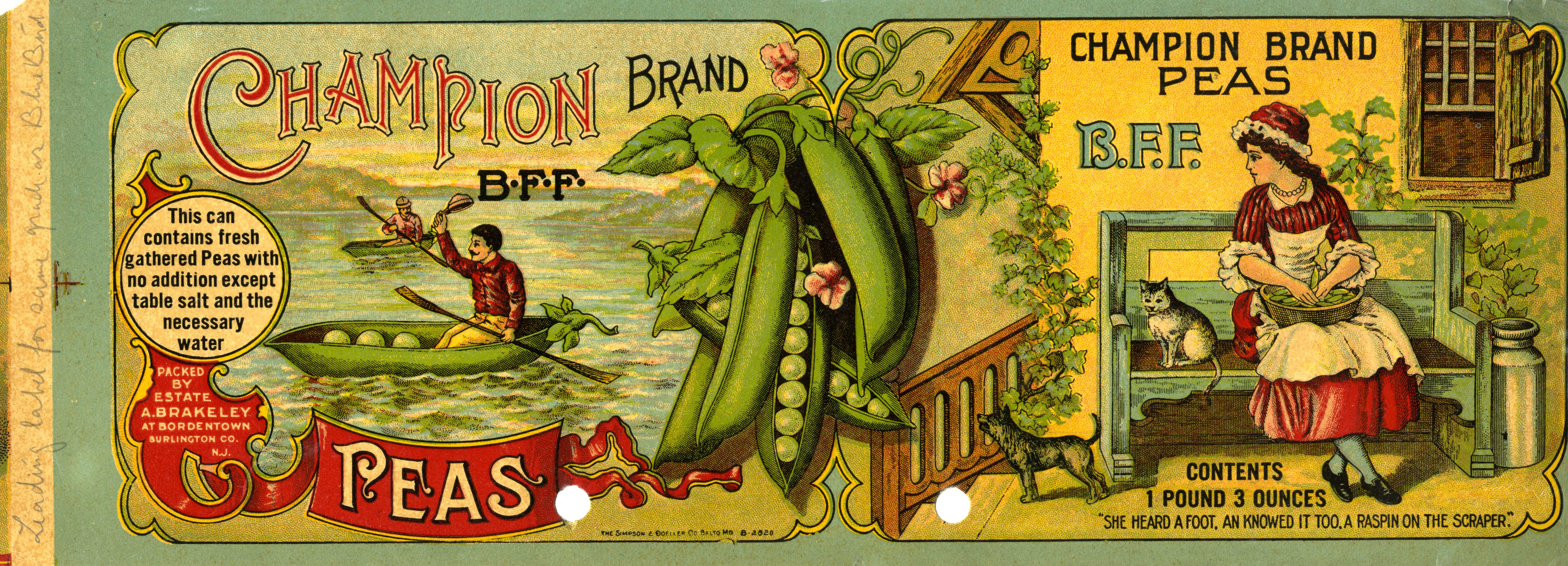
Champion Brand Peas can label
The pattern
This still is filed under Pack as storefront.
Define
The pack is the store. On a shelf or a thumbnail, it must stop, name, and close without a clerk.
Mechanism
Shelf rhetoric. Hierarchy, claim, and proof live on the face. The first five centimeters do the campaign's job.
Verdict
The buy happens in a glance among competitors: grocery, pharmacy, app store icon.
Why it works
The pun is the whole idea and it is executed at full size rather than as a small device, which is why an abstract brand word turns into something a shopper can describe to a grocer. Building the racing shell out of the product itself keeps the joke from being decoration, because you cannot see the boat without seeing the peas. The layout is the same three-zone grid as the packer's other labels, name and reassurance left, ingredient evidence centre, domestic scene right, so the house can ship a new brand by replacing only the left third. The reassurance roundel is kept in the same slot as on the sibling labels, which means the compliance copy is never negotiated against the artwork, it simply has a permanent address.
Steal this when
Use this when the brand name is a word with no inherent link to the product and you want it to stick: build one image that can only be made out of your own product and let it own the largest panel. The fixed three-zone grid is worth copying whenever one producer ships many brands and needs artwork that changes in one place only.