
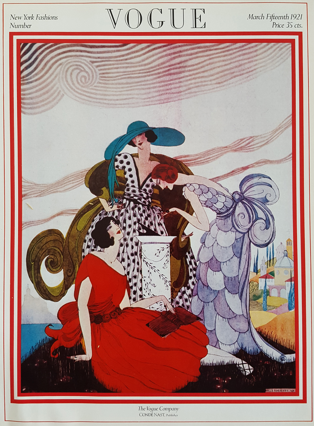
Vogue, March 1921 - cover
The pattern
This still is filed under Image carries the claim.
Define
One image does the entire argument. Copy, if any, is a caption, not a second ad.
Mechanism
Pictorial claim. The picture is readable as a sentence. If we need a paragraph, we picked the wrong picture.
Verdict
The idea is visual and the surface is a poster, a feed, or a silent frame.
Why it works
Three flat colours do all the work - teal, scarlet and lavender - held apart by large areas of pale ground and by the black-and-white dot pattern that acts as a neutral between them. The composition is built on nested scrolls: the chair back, the cape, the hat scarf and the ribbon border all repeat the same curl, which is what makes a crowded page feel ordered. The garments are drawn as flat decorative shapes rather than modelled cloth, so the cover reads as pattern first and as clothes second, exactly the Art Deco shift this year marks. The issue line at top left does the news work in four words, leaving the picture free to be seductive rather than informative.
Steal this when
Use this when an issue, drop or collection has a name worth announcing and you want the announcement to sit as a quiet corner line over a picture that does the persuading. Also the model to copy when you need several saturated colours on one page and need a patterned neutral to keep them from fighting.