
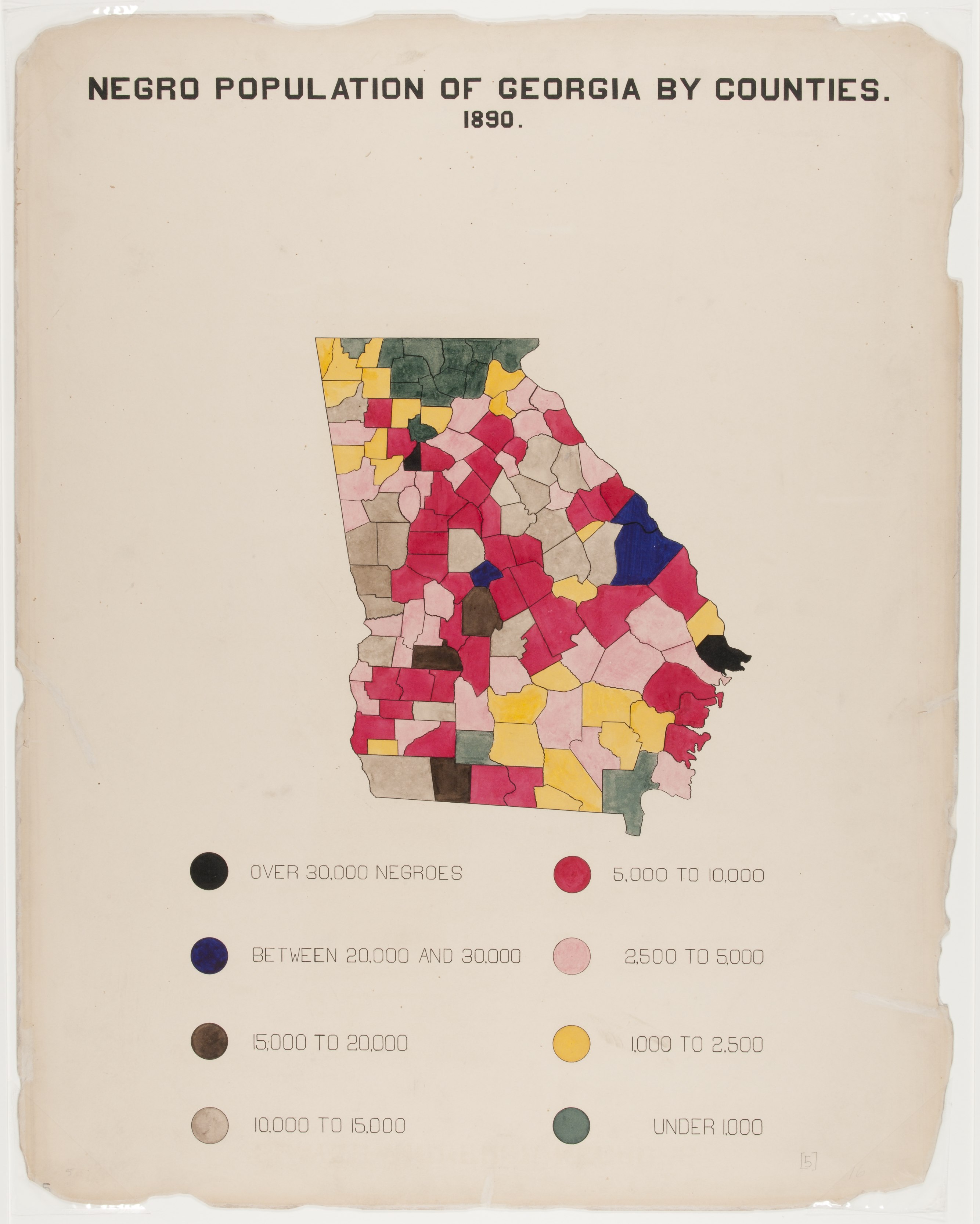
The Georgia Negro: A Social Study - Diagram shows map of Georgia with colors to mark the number of African Americans in each county [LCCN2013650424]
The pattern
This still is filed under Data as proof.
Define
A chart, map, or count that is the argument, not an illustration next to the argument.
Mechanism
Sighted evidence. The reader is asked to believe their eyes: a bar, a share, a spread on a map.
Verdict
The claim is comparative or quantitative and the figure can be read without a caption doing the sell.
Why it works
The classes are coded by hue rather than by a single sequential ramp, so the map reads as a set of named categories rather than a gradient - the black and navy counties register as a different kind of place, not merely a darker shade. Setting the map small and high and giving the eight-disc key the entire lower third makes the legend part of the composition instead of furniture, which is what allows a non-obvious colour order to be learned in one pass. Hand-brushed washes keep every county individually made, so the reader sees a hundred and thirty-seven decisions rather than a fill pattern.
Steal this when
Use it when a geographic distribution has meaningful thresholds rather than a smooth gradient and you want the top band to read as a separate class. Give the legend real estate whenever your colour order is not self-evident.