
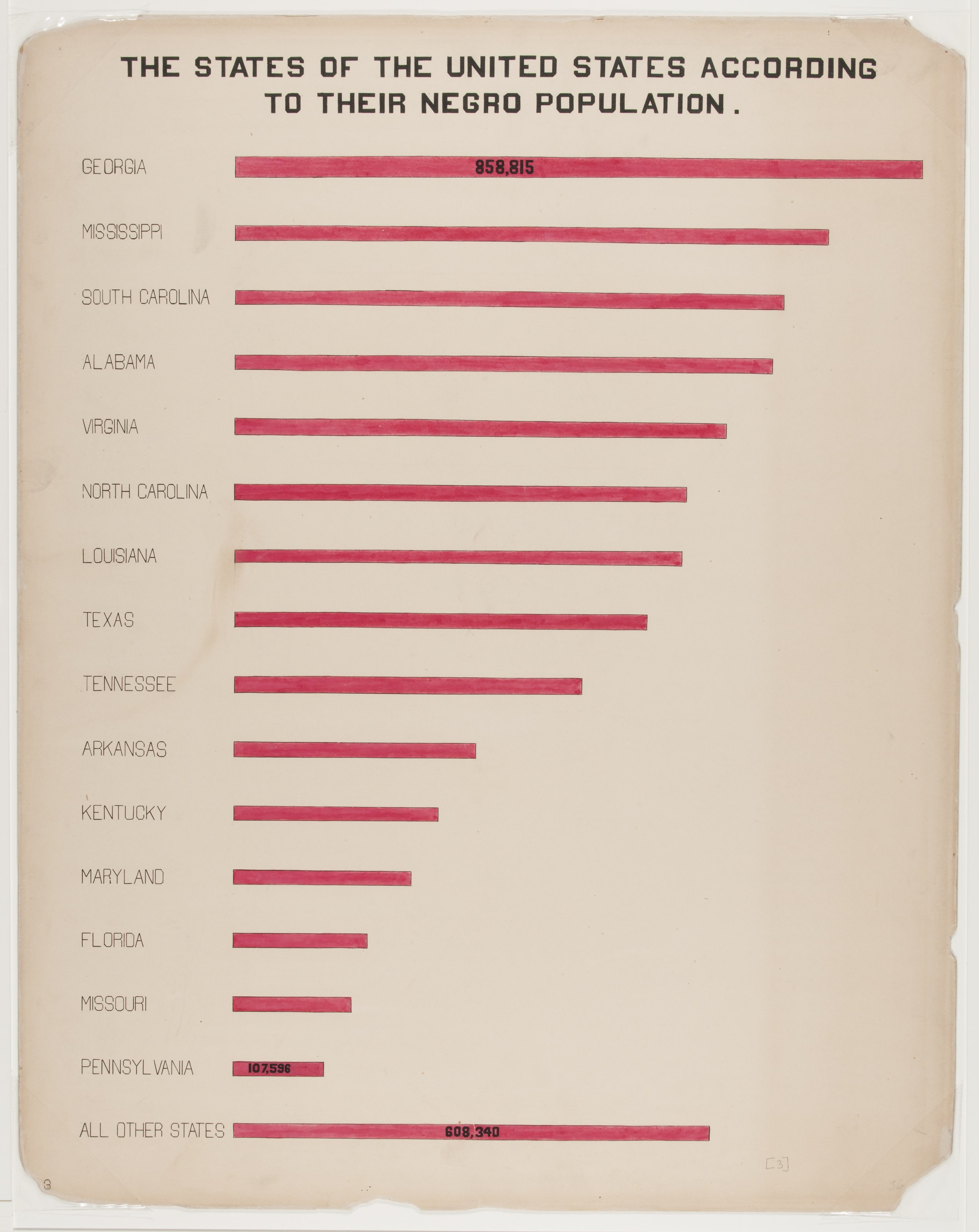
The Georgia Negro: A Social Study - Bar graph shows the number of African Americans in states, with Georgia having the highest population [LCCN2013650422]
The pattern
This still is filed under Data as proof.
Define
A chart, map, or count that is the argument, not an illustration next to the argument.
Mechanism
Sighted evidence. The reader is asked to believe their eyes: a bar, a share, a spread on a map.
Verdict
The claim is comparative or quantitative and the figure can be read without a caption doing the sell.
Why it works
It is a ranked bar chart that withholds almost all of its numbers on purpose - printing only the top value, the bottom named value and the residual forces every other comparison to be made by length, which is the comparison the plate wants. The real device is the last bar: rather than truncating the tail, the whole remainder of the country is collected into one ALL OTHER STATES bar and parked below the ranking, where it reads shorter than Georgia alone. That single move turns a league table into a claim about why Georgia was chosen as the subject.
Steal this when
Use it when you need to justify a choice of sample, market or case study by showing it outweighs the alternatives. The collapsed everything-else bar is the move to copy whenever a long tail would otherwise dilute the top of your ranking.