
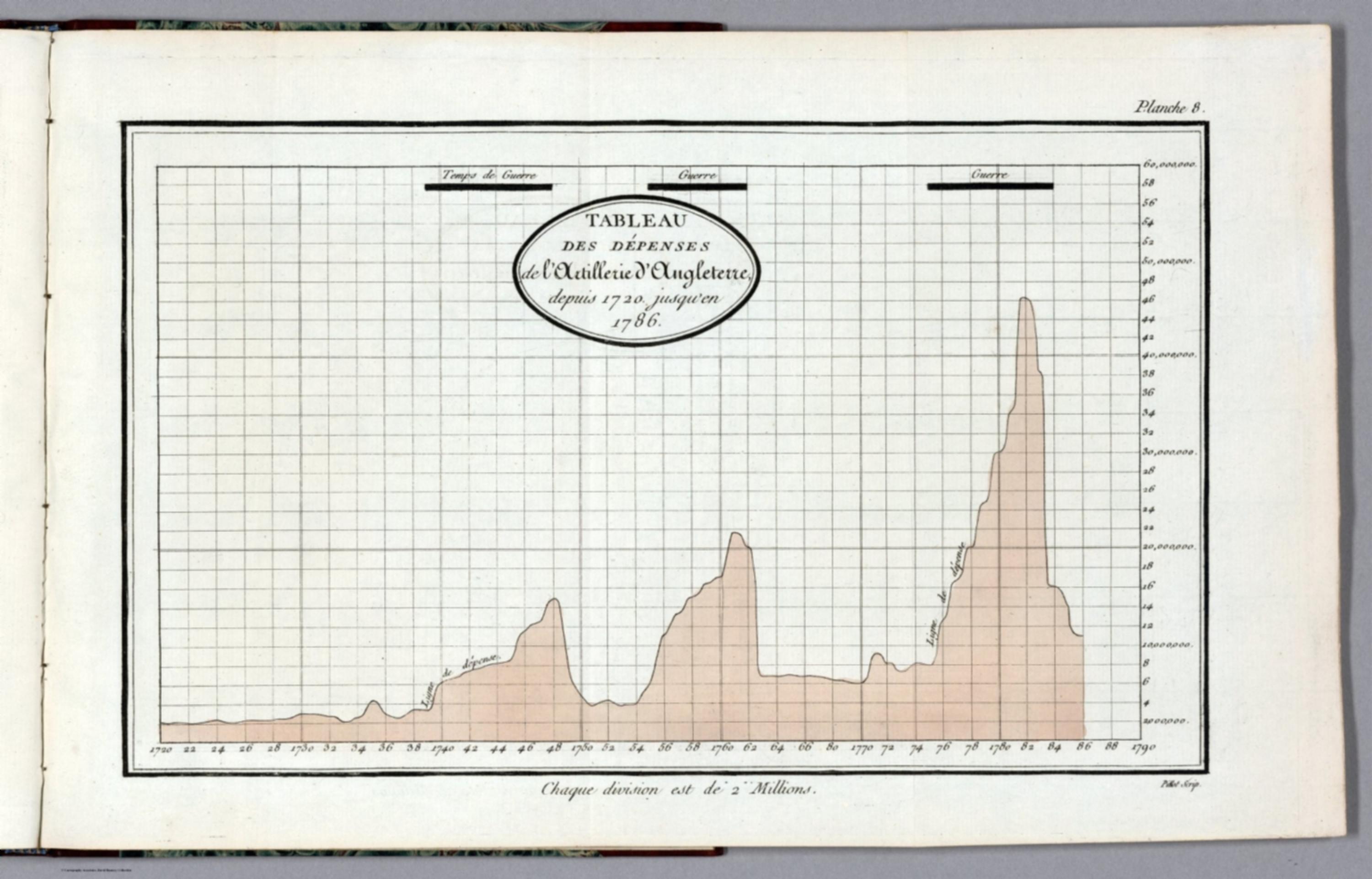
Tableaux d'arithmetique lineaire (French edition of the Commercial and Political Atlas) - Tableau des dépenses de l'Artillerie d'Angleterre, depuis 1720 jusqu'en 1786. Pillot Scrip [14319.061]
The pattern
This still is filed under Data as proof.
Define
A chart, map, or count that is the argument, not an illustration next to the argument.
Mechanism
Sighted evidence. The reader is asked to believe their eyes: a bar, a share, a spread on a map.
Verdict
The claim is comparative or quantitative and the figure can be read without a caption doing the sell.
Why it works
This is the annotated period band in its earliest form: the war bars are a second data series laid on the same time axis, so the relationship between war and spend is established by vertical alignment rather than by a sentence of explanation. Because the bars sit above the plot rather than behind it, they annotate without dirtying the curve. The scale drops by a factor of five against the companion troop plate, two millions per division instead of ten, which keeps a much smaller quantity legible at the same sheet size; the cost is that the two plates cannot honestly be compared by eye, and the small key at the foot is the only warning of it. Naming the line inside the plot keeps the reader's eye from leaving the frame to decode anything.
Steal this when
Use it when a metric moves because of discrete external events and you want those events drawn as bands on the same time axis instead of listed in a footnote. Also use it as the warning case: when you rescale one chart in a series, say so louder than a caption.