
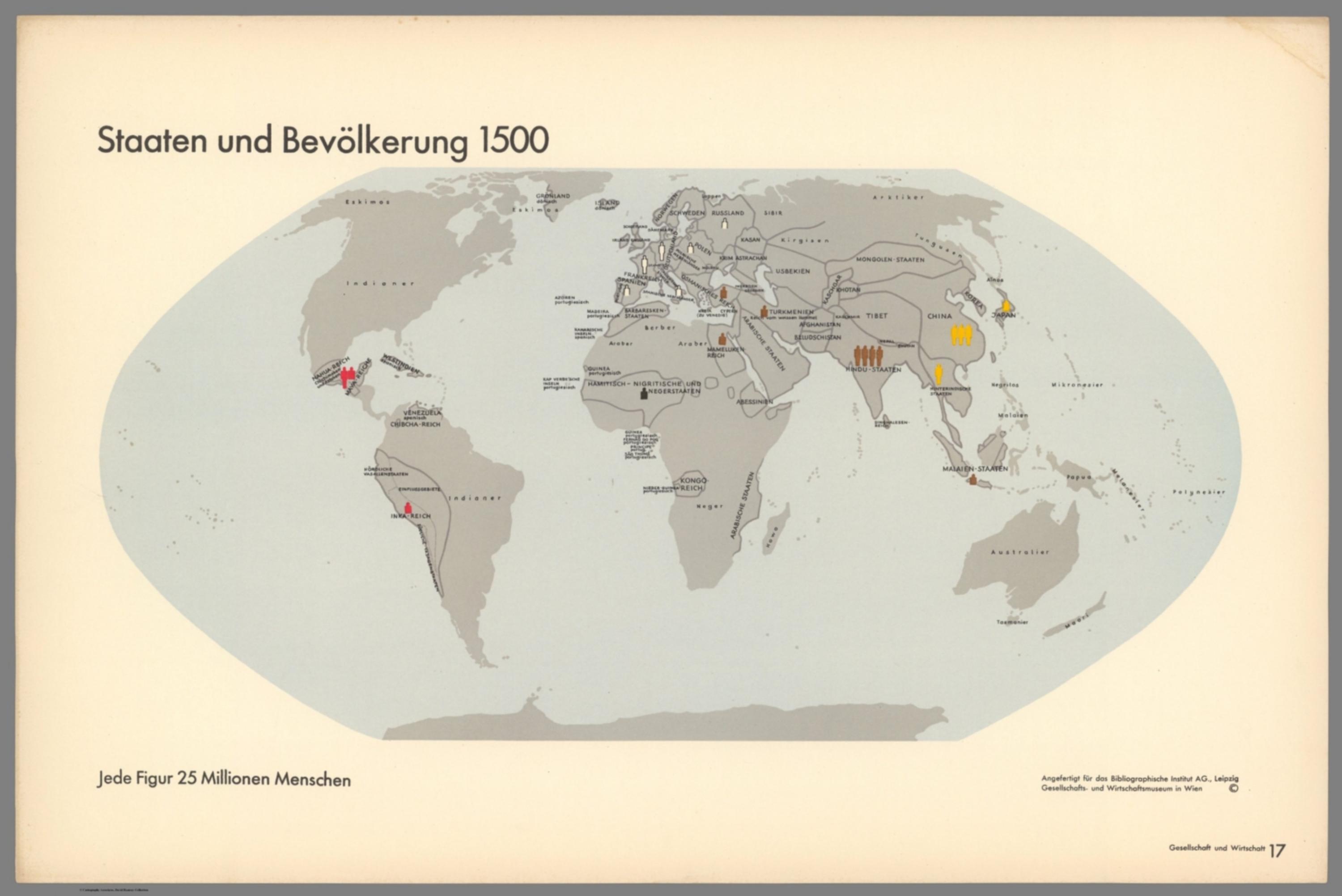
Gesellschaft und Wirtschaft: Bildstatistisches Elementarwerk - Staaten und Bevölkerung 1500 [14080.020]
The pattern
This still is filed under Data as proof.
Define
A chart, map, or count that is the argument, not an illustration next to the argument.
Mechanism
Sighted evidence. The reader is asked to believe their eyes: a bar, a share, a spread on a map.
Verdict
The claim is comparative or quantitative and the figure can be read without a caption doing the sell.
Why it works
Draining every square inch of the map to grey and blue-grey makes the coloured figures the only thing on the page with any voltage, so the reader's attention lands exactly where the data is and the empty continents register as emptiness rather than as unmapped space. Counting people in fixed figures rather than shading countries defeats the area illusion that makes Russia and Canada look important on a conventional world map. Colour groups the figures into culture blocs, so a second variable rides on the same mark at no extra cost, and the reader picks up the grouping from adjacency before reading any label. Naming peoples as well as states across blank areas - Indianer, Neger, Papua - keeps those regions inhabited rather than presenting them as void.
Steal this when
Use this when the honest weight of something is not proportional to the space it occupies on the obvious diagram - population against land, revenue against headcount, risk against asset count. Kill all colour in the base, then spend it only on the counted units.