
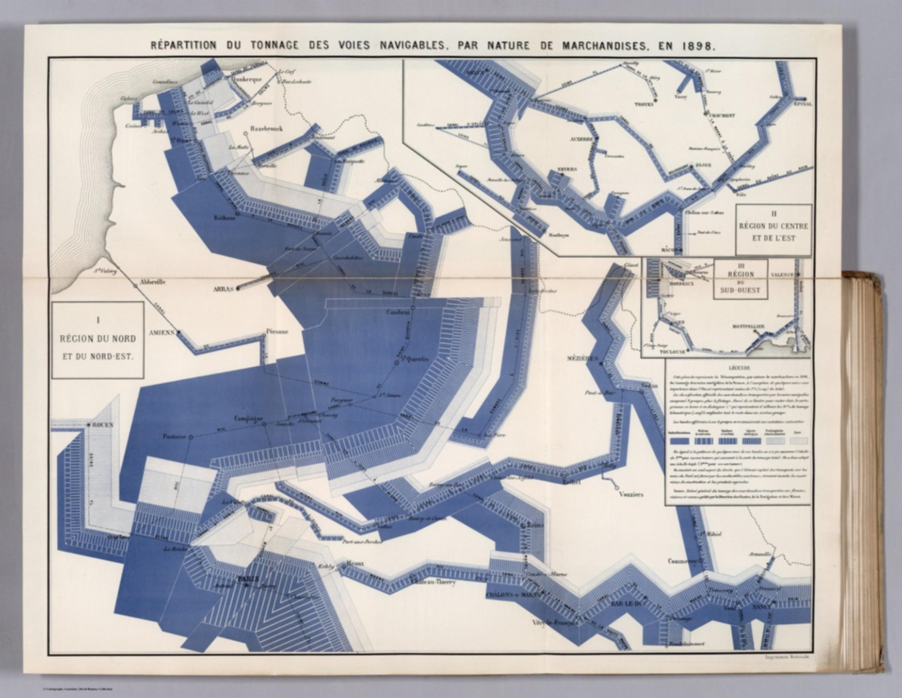
Album de Statistique Graphique - Repartition du Tonnage des Voies Navigables, par Nature de Marchandises, en 1898. (Breakdown of the Tonnage of the Waterways, by Nature of Goods, in 1898.) [12526.026]
The pattern
This still is filed under Data as proof.
Define
A chart, map, or count that is the argument, not an illustration next to the argument.
Mechanism
Sighted evidence. The reader is asked to believe their eyes: a bar, a share, a spread on a map.
Verdict
The claim is comparative or quantitative and the figure can be read without a caption doing the sell.
Why it works
The plate abolishes the separate bar chart by encoding quantity into the geography: band width is tonnage, so the route and the number are one mark and the eye never has to marry a map to a chart beside it. Inside that band, stripe fill splits the total into cargo classes, which gives a stacked breakdown at every point on the network rather than one national figure. Because the width scale is fixed across the main sheet and both regional insets, the small panels stay honestly comparable with the big one instead of being decorative. The whole thing is engineered to answer one ministerial question, which stretch of water is worth money, off a single look.
Steal this when
Use this when the quantity travels along a path and the route matters as much as the number: freight, pipeline throughput, network traffic, referral flow, stage-to-stage volume in a funnel. Widen the path itself to the volume and stripe it by segment, instead of putting a map next to a bar chart and making the reader join them.