
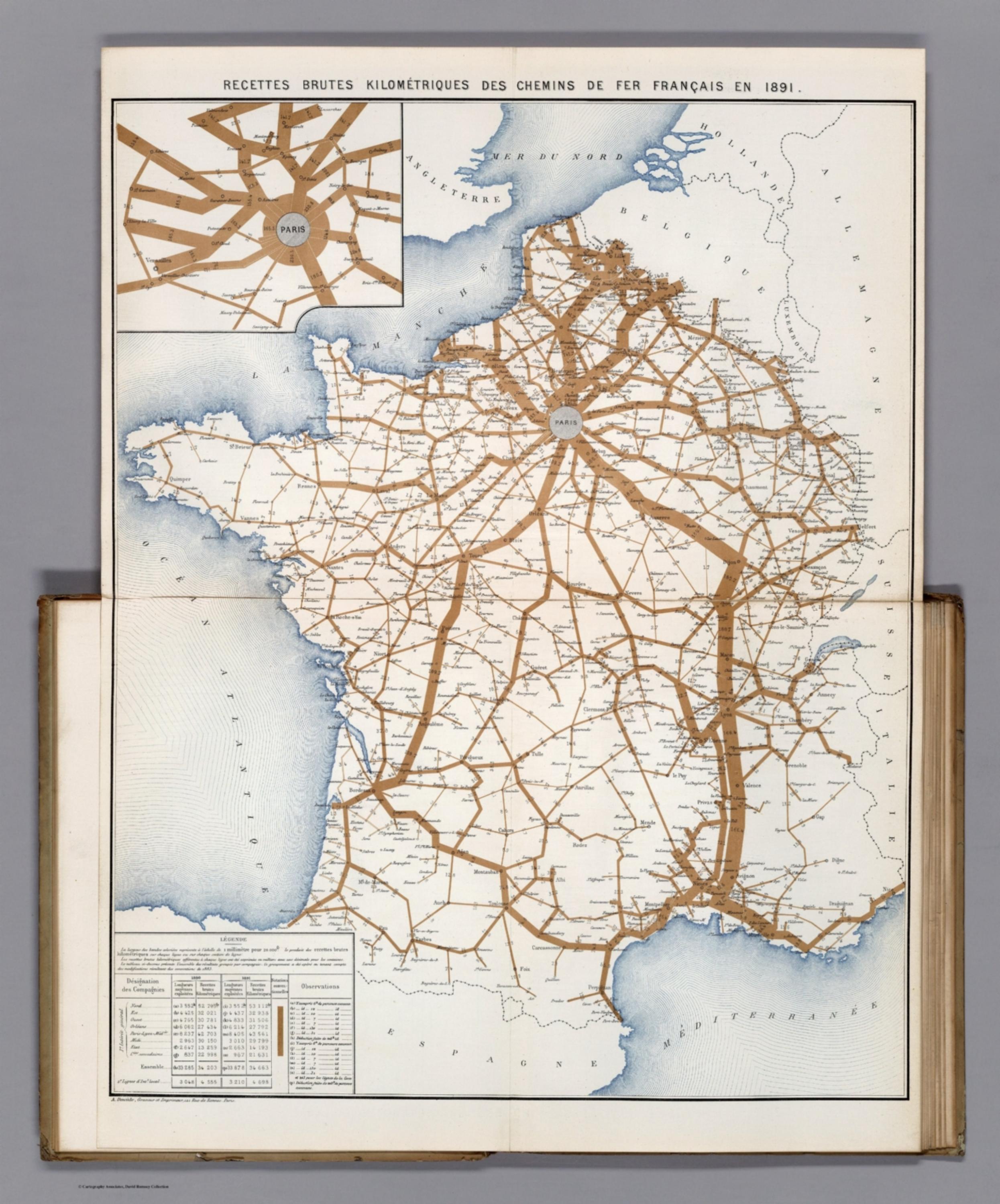
Album de Statistique Graphique - Recettes Brutes Kilometriques des Chemins de Fer Francais en 1891. (Gross earnings of the French railroads in 1891.) [12523.013]
The pattern
This still is filed under Data as proof.
Define
A chart, map, or count that is the argument, not an illustration next to the argument.
Mechanism
Sighted evidence. The reader is asked to believe their eyes: a bar, a share, a spread on a map.
Verdict
The claim is comparative or quantitative and the figure can be read without a caption doing the sell.
Why it works
It encodes one variable as line width on a map the reader already knows by heart, so the comparison needs no axis, no key reading and no arithmetic - geography supplies the labels for free. The palette is deliberately starved: one ink for data, a receding blue for sea, nothing else, which is why a band twice as thick reads instantly as twice the money instead of competing with decoration. The Paris inset is a scale break, not an ornament; it solves the standard flow-map failure where the hub saturates and destroys the very detail the hub most needs. The table underneath keeps the graphic honest by letting a sceptical reader audit any ribbon against the printed figure.
Steal this when
Use this when a network or territory is the natural index of your data - branches, stores, routes, regions - and the decision is where to invest or cut. Encode the single money variable as stroke width on the map, and always break out the congested hub as its own inset instead of shrinking the whole thing.