
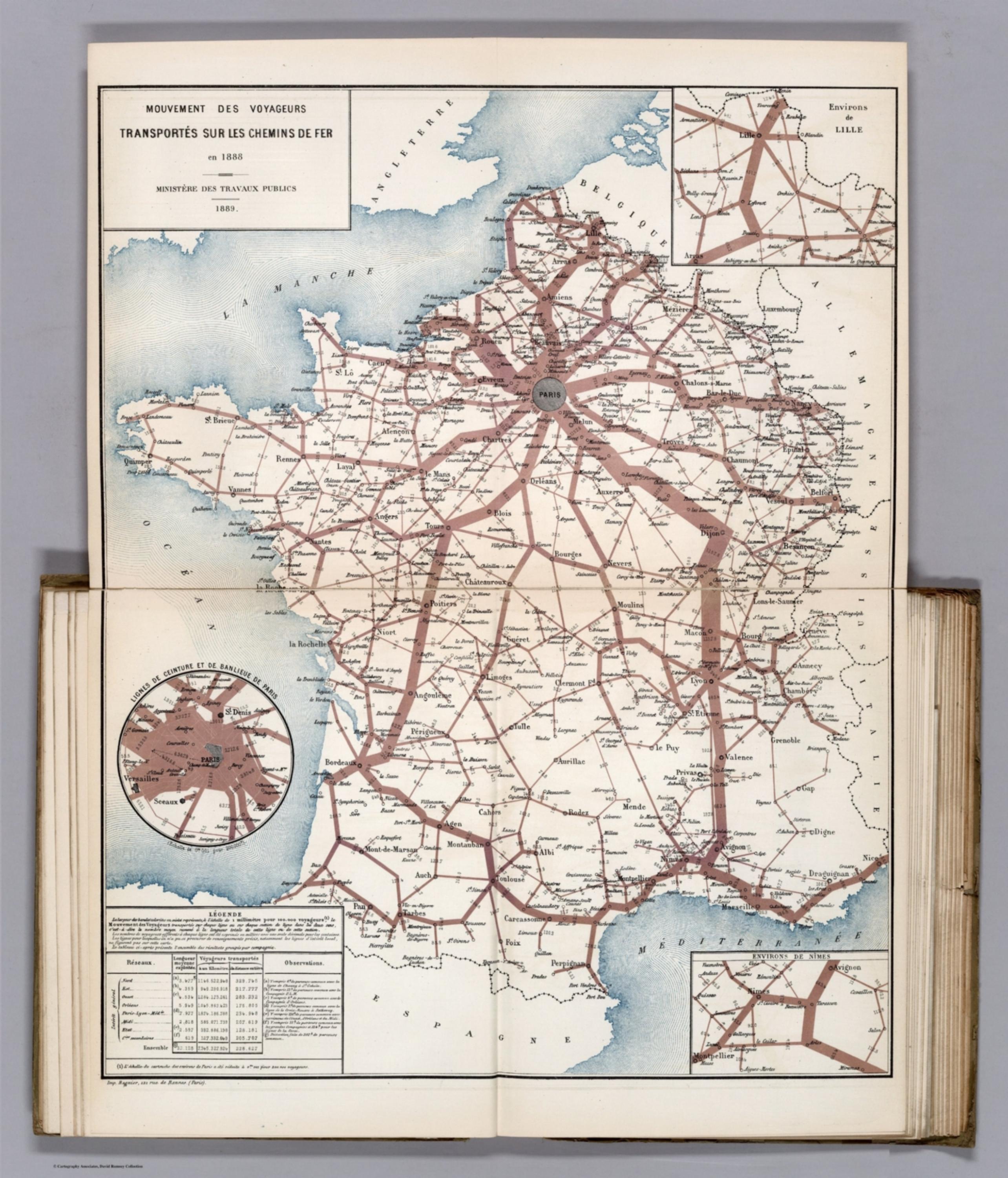
Album de Statistique Graphique - Mouvement des Voyageurs Transportes sur les Chemins de Fer en 1888. (Movement of the travellers transported via the French railroads in 1888.) [12520.018]
The pattern
This still is filed under Data as proof.
Define
A chart, map, or count that is the argument, not an illustration next to the argument.
Mechanism
Sighted evidence. The reader is asked to believe their eyes: a bar, a share, a spread on a map.
Verdict
The claim is comparative or quantitative and the figure can be read without a caption doing the sell.
Why it works
Holding the whole map to one hue means width is the only variable, so there is nothing to decode and the traffic hierarchy is read pre-attentively. The tapering bands follow the real route, which merges the network's geometry with its load and shows where traffic is shed at each junction. The circular Paris inset is a scale escape hatch: the capital's lines would otherwise blot out the middle of the country, so they are lifted into their own frame at their own scale. The company table converts a national picture into an accountable one, since every operator can find its own line and its own total.
Steal this when
Use this when one network carries wildly unequal load and the argument is about concentration - traffic, spend, headcount, shipments. Keep to a single hue and let width do all the work, then lift the one region that would otherwise swamp the sheet into its own inset at its own scale.