
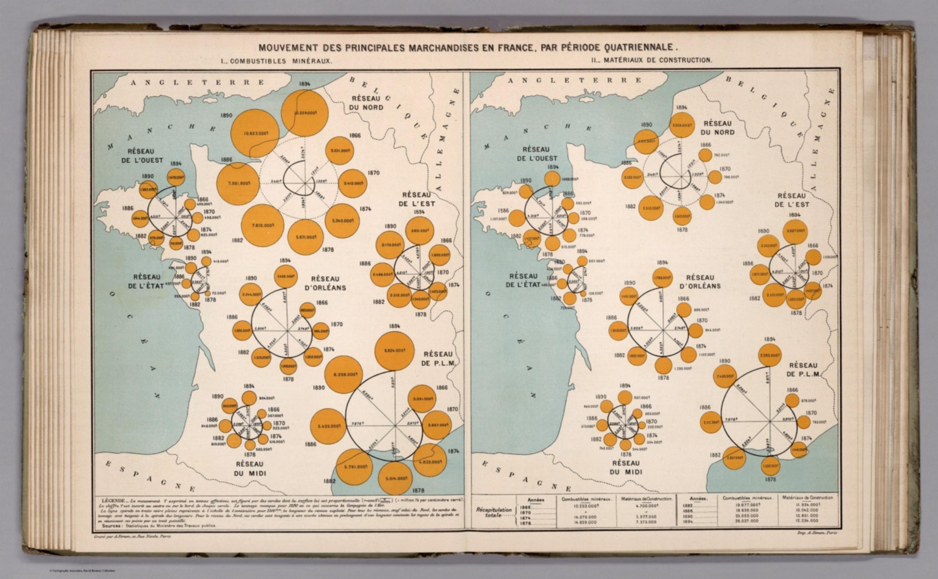
Album de Statistique Graphique - Mouvement des Principales Marchandises en France par Periode Quatriennale. I. II. (Transport by nature of goods on the steel-tipped ways from 1866 to 1894: I. Combustible minerals. II. Building materials.) [12525.023]
The pattern
This still is filed under Data as proof.
Define
A chart, map, or count that is the argument, not an illustration next to the argument.
Mechanism
Sighted evidence. The reader is asked to believe their eyes: a bar, a share, a spread on a map.
Verdict
The claim is comparative or quantitative and the figure can be read without a caption doing the sell.
Why it works
Time is mapped to angle and quantity to area, which converts a growth series into a shape - a tight ring means stagnation, a fat outward spiral means a network that quadrupled - and shape comparison across seven networks is faster than reading seven line charts. Placing each clock on its own territory fuses the what-grew question with the where question in one object. Printing the raw tonnage next to every disc is the safety valve: circle area is notoriously hard to judge, so the design leans on the spiral for pattern and the printed number for value, rather than pretending area alone is precise.
Steal this when
Use this when you need to compare the growth trajectories of several units that each have a place - regions, branches, markets - and a small-multiple line chart would lose the geography. Encode period as angle, magnitude as area, and always print the number beside each mark.