
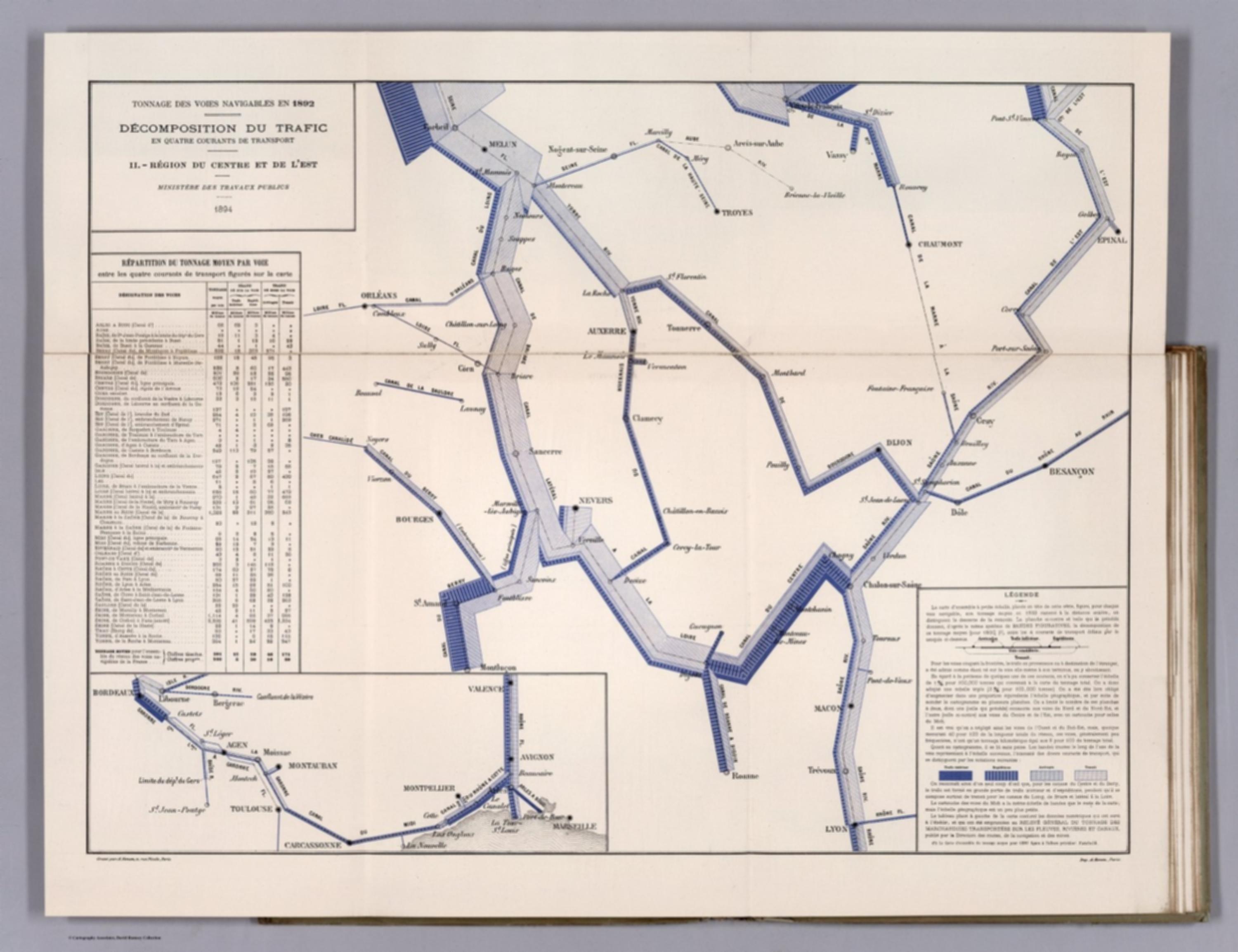
Album de Statistique Graphique - Decomposition du Trafic en Quatre Courants de Transport. II. Region du Centre et de L'Est. (Breakdown of the tonnage of the inland waterways in four currents of transport: Area of the Centre.) [12524.025]
The pattern
This still is filed under Data as proof.
Define
A chart, map, or count that is the argument, not an illustration next to the argument.
Mechanism
Sighted evidence. The reader is asked to believe their eyes: a bar, a share, a spread on a map.
Verdict
The claim is comparative or quantitative and the figure can be read without a caption doing the sell.
Why it works
The move is decomposition inside the mark itself: instead of four maps or four colours fighting on one line, the band's thickness carries total tonnage while its internal banding carries the mix, so magnitude and composition are read in a single glance at the same object. Dropping the coastline and the départements strips out every pixel that is not traffic, which is why a network with no basemap still reads as France. The tiny exhaustive table is doing the work of a data appendix in the same field of view, so the graphic can stay coarse without being unfalsifiable.
Steal this when
Reach for this when a flow has both a size and a mix - revenue by channel along a pipeline, traffic by source through a funnel - and you were about to draw four separate charts. Band the single flow internally instead, and park the exhaustive numbers in a hairline table on the same sheet.