
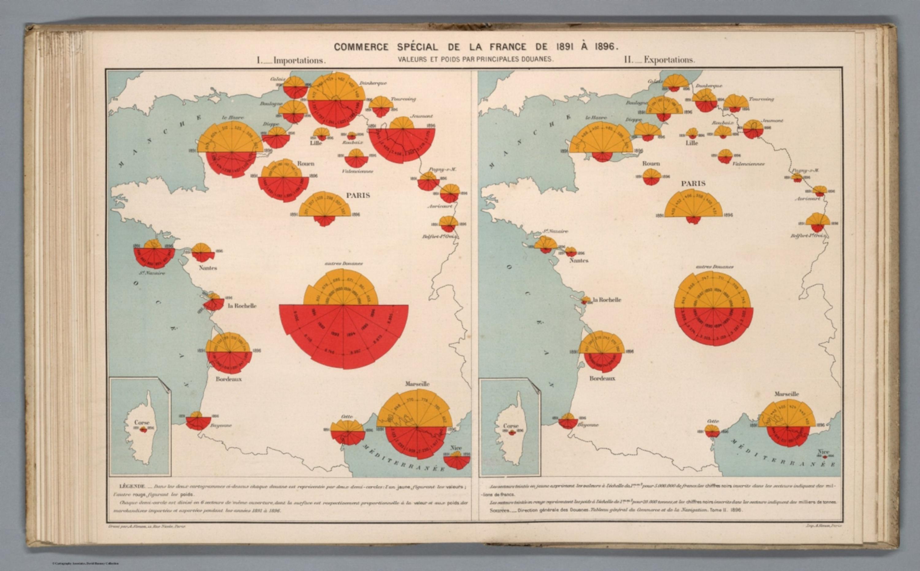
Album de Statistique Graphique - Commerce special de la France de 1891 a 1896. Valeurs et poids par principales douanes. I. Importations. II. Exportations. Gravepar A. Simon. Imp. A.Simon, Paris. (inset) Corse [13188.029]
The pattern
This still is filed under Data as proof.
Define
A chart, map, or count that is the argument, not an illustration next to the argument.
Mechanism
Sighted evidence. The reader is asked to believe their eyes: a bar, a share, a spread on a map.
Verdict
The claim is comparative or quantitative and the figure can be read without a caption doing the sell.
Why it works
The split disc is a dual-axis chart that does not lie: two measures with no common unit are kept in separate hemispheres rather than being forced onto one scale, while the shared centre still lets the reader see when value and weight diverge - a wide yellow half over a small red half means expensive light goods. Constant sector angle with varying radius turns the six-year series into a silhouette, so trend is read as a profile rather than by comparing six numbers. Two identical panels for imports and exports means the reader learns one symbol and applies it twice, and any asymmetry between the panels is immediately a finding.
Steal this when
Use it when one location or account has two metrics that must not be added together - volume and value, users and revenue - plus a short time series for each. Split the mark, give each metric a hemisphere and a colour, and repeat the whole map for the opposite direction of the flow.