
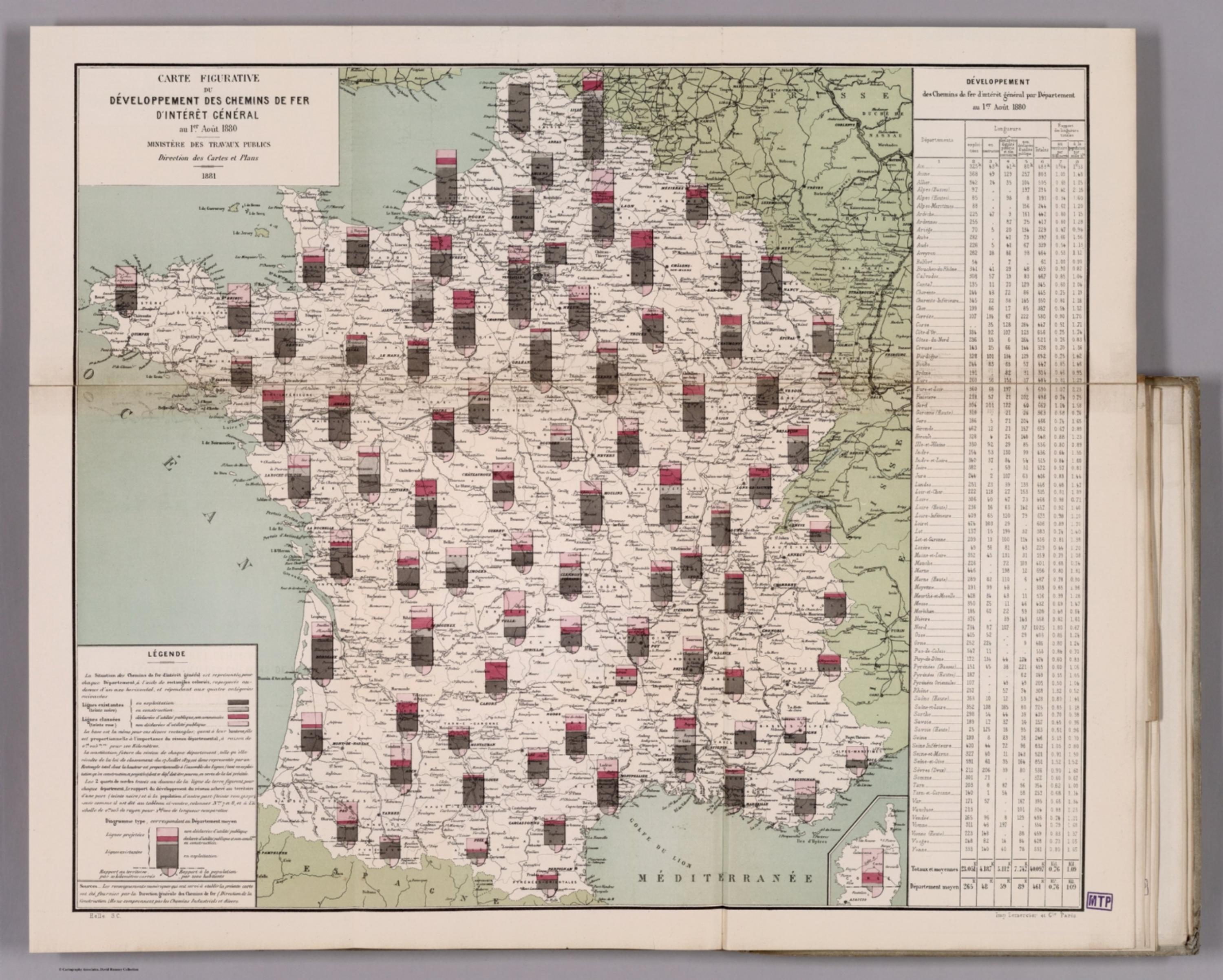
Album de Statistique Graphique - Carte Figurative du Developpment des Chemins de Fer D'Interet General au 1er, Aout 1880. (Development of the General Interest Railways on the 1st, August 1880.) [12512.026]
The pattern
This still is filed under Data as proof.
Define
A chart, map, or count that is the argument, not an illustration next to the argument.
Mechanism
Sighted evidence. The reader is asked to believe their eyes: a bar, a share, a spread on a map.
Verdict
The claim is comparative or quantitative and the figure can be read without a caption doing the sell.
Why it works
It is a small-multiple grid disguised as a map: the same chart is repeated with identical encoding at every location, so the reader learns the chart once and then reads geography. Ordering the four bands by legal stage, from built at the bottom to merely conceded at the top, makes progress literally readable as how far up the colour has climbed. Including a Diagramme type for the average department gives every local capsule a silent benchmark, which converts a descriptive map into a comparative one.
Steal this when
Use this when the same multi-stage pipeline exists in many territories or accounts and the client wants both the total and the mix. Adding a typical or average diagram to the legend is the cheap move that turns a set of small multiples into a scorecard.